Wednesday, November 25, 2009

You Have no Rights, Play Nice - 11-25-09

As many music lovers know, Digital Rights Management, DRM for short, is the term for the piracy protection inserted in many music files purchased through a download store such as Zune Marketplace or iTunes.
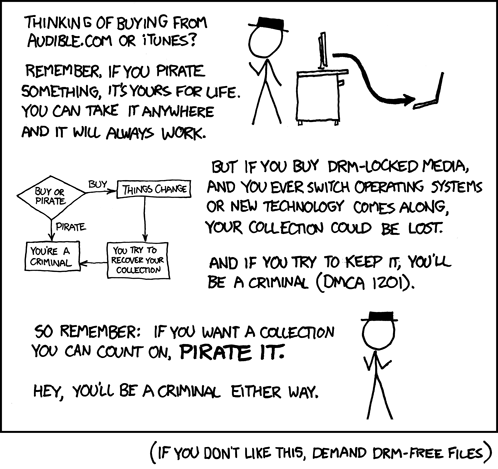


DRM is broken idea created by an organization that still has no idea how the internet works and is terrified by it. Much like other anti-piracy measures, music DRM does little to stop piracy but does much to hinder the experience of legitimate owners. DRM can be broken, but the users who fall under bad luck who don’t know how to circumvent it because they don’t want to be pirates, lose access all of their files. However, most stores allow customers to re-download a song a set number of times (usually between 3 and 5) before they have to call customer support to get more downloads. What’s truly unfortunate is that DRM is based around the concept about digital media that consumers purchase a license to use it, as opposed to something they own and can do whatever they want with. This hurts consumers who are used to the idea of purchasing something and owning it. The best piracy prevention I have experienced is a music store that is easy to access. If I can buy a song easily, I have no reason to steal.

Most digital music stores provide DRM-Free MP3 versions of most, if not all, of their songs. The risk here is that if something happens to the mp3 file, the consumer is completely out of luck. Mp3s are not eligible for re-downloading and, in some cases, are not capable of being re-purchased. It recreates the ownership life, with the possibility of losing everything with a disaster. However, unlike most property, your files are much more fragile, capable of being destroyed by a bad-timed power outage.

From Sensory Overload to Gadget Glory - 11-25-09

Engadget.com got a redesign last week. It’s pretty amazing how it changes the impression of what Engadget is. It looks like a site for gadget news and features as opposed to a gadget blog.


When I first saw it, all the colors and text put me into a pseudo-coma from all the information being pounded into my brain. After that subsided, I was quite impressed with the presentation. All of the stories deemed important by the Engadget staff at the very top of the page before the user can see any other news posts. It gives the feeling of a company that really cares about how they look so that when someone links to them, the user following the link sees that the website is reputable and professional. Blogs have a negative connotation, especially for people who do not follow blogs on a regular basis as their news source, so making a blog site look different than a typical blog is a great design choice.

In my week of using it, I only have one issue with the site. With all of the top-of-page featured content, my 1280x1024 resolution monitor does not see any brand new news content without scrolling. I only have to scroll slightly, but I feel that dedicating that much real-estate to content that may not be the “hottest new thing” does not seem like the best idea.

Hot Recorder, Not-so-Hot Website - 11-25-09

I was looking around the internet last week or so, looking for the tools I would likely need to be able to podcast, specifically Skype-based podcasts. I was directed to the site for HotRecorder, a program that would allow me to use Skype to record multiple participants easily. However, I could not stay at the site long enough to look further into the product as the design repulsed me.


The only explanation I could determine for myself is that it was designed for touchscreen smartphones like the iPhone or Droid. To test its mobile-centric design, I fired up my BlackBerry’s Opera browser and loaded it up. I assure you, it was either designed specifically for the iPhone or for an audicence that does not exist in this world. A horizontally based website is unique, to see the least, but it’s not feasible. It’s not Flash-based, so they couldn’t incorporate a navigation tool that acts like the Hand in Photoshop and Illustrator, and none of my mice have the ability to scroll left and right.

Also, their background design flickers when I scroll, making the page all the more painful to use. A preliminary google search for the designer page brings up no results. I had never seen a horizontal site before, so I googled that instead, and found the perfect example of how to operate one. The Horizontal Way uses mouse-touch sensitive buttons for smooth navigation across the layout. It also advocates the use of Horizontal Pages as a way to better take advantage of the real estate provided by computer monitors, mentioning how “Another value of the horizontal site is that it can utilize almost all the space offered by the browser’s viewport.”

We’ll Stick Together as We’re Writing a Blog Post - 11-25-09

Tripping Down the Freeway is a new song from Weezer on their new album, Raditude. A cheery melody with lyrics that could be interpreted in multiple ways, it’s my favorite song on the album.


I listen to most of my music while driving or walking, and this song’s rhythm has a great sense of motion. In my mind, I can see the lines of the road or cracks in the sidewalk passing by as the song progressing. My favorite part is what I consider to be the climax of the song where only the vocals and guitar are heard, which gives me the sensation of being on a long curve where the “g’s” of the turn are pushing you into the car a bit.


I was interested to see if anyone else on this wonderful series of tubes, better known as the Internet, shared similar feelings in regards to driving songs and motion. One of the first results I found on google was a list on DormDelicious.com. Number 21 was song I enjoyed, Shipping up to Boston by the Dropkick Murphys. I wanted to listen to it again, so I found the Youtube video of their music video. Imagine my surprise when the beginning of the song, and all of the “action” later, is based around motion: trains, car rides, foot chases, the whole nine yards. There has to be something to this idea of a driving song conveying the idea of motion if a director is going to show various acts of movement to accompany a song like that.

Tuesday, November 24, 2009

Mac Shmack. Dock Shmock. 11-24-09

As the rest of my blogs have likely made very clear, I am a fan of the products designed by Microsoft, especially the more recent, “shinier”, products. This continues with Windows 7’s new Taskbar.


First, let’s get something out of the way. It is as close to a rip-off of the Mac OS X dock as Microsoft could do without it being a one-to-one port of it. Part of me appreciate the gusto necessary to make that drastic of a design choice, going so far as using a feature of a competitor and acknowledging their good design decisions.

With that out of the way, I’d like to touch on the differences and what makes it such an expertly designed feature of Windows 7. The biggest difference is that it takes up less vertical space than the Dock’s default setting and the “background” is wallpaper unlike OS X’s “platform.” Also, by giving the user a set area to place icons gives a better idea of how much space he or she can use, as opposed to a smaller size that a user must discover its ability to stretch on his or her own.

From personal experience, a reason I have never been interested in switch to Mac from Windows has been the differences in UI design theory. However, with the Dock-like taskbar in 7, Microsoft may end up biting themselves in the butt. Windows 7 on a whole is a very Mac-like experience, where it is aesthetically appealing while also being fast and easy to use. With Apple being more and more aggressive with their pricing, Apple may be able to make in-roads to Windows users thanks to none other than Microsoft.

My DJ is Smarter Than Yours 11-24-09

Smart DJ is a feature in the 4.0 version of the Zune software for Windows. For iTunes or Last.FM users, it’s similar to the Genius playlists or the “Play Your Recommendations” playlists, respectively. It takes information of the user, in the case of Smart DJ by what the user asks for, and gathers songs together into a playlist of up to 100 songs.

The main differentiating point of Smart DJ versus Genius or Last.FM is how it takes advantage of the Zune Pass. You can tell a Smart DJ playlist to look for songs from your hard drive, the Zune Marketplace and your Hard Drive, or just the Zune Marketplace. The last two features are only possible for users of the Zune Pass. Combine it with the ability to tell the playlist to refresh and find new songs on a schedule of your choosing and you have a constantly changing list of songs based on an artist, album or song that you already enjoy and want to find more like it.

Were I working at Microsoft, there is definitely something I would change. There is no way to tell the Smart DJ to not grab certain artists/songs/albums. My guess is that the DJ feature is more limited than Microsoft lets on, where each artist only has a handful of other artists to take songs from. If that’s not the case, then I would love it even more if I could listen to my Lilly Allen playlist without it having to skip all of the Coldplay and The Fray selections that it throws at me.

Office 2010 11-24-09

Microsoft is on a beta kick these days. Last year, they made a beta version of the New Xbox Experience, the new update for the Xbox 360 that came out Fall 08, available to over 40,000 Xbox LIVE users. In January, they made a beta for Windows 7 available and followed it up with the Release Candidate in May. As of last week, the big MS has made a beta for their Office 2010 suite of software available. Here’s the kicker: all of these betas have been excellent, but I’ll talk about Office here because it’s the new hotness.

I’ll get the performance stuff out of the way first. It’s fast. The splash icon that pops up before the program does tells you what it’s doing now. You can even kill the program when it’s starting up from the splash icon in case you accidentally open the wrong program.

Visually, it’s a refinement of the 2007 suite of Office. The Ribbon menu system is still here, but it has been touched up a bit. It has even made its way into Outlook. So in short, if you hate the Ribbon, you’re still not going to like 2010, but I love the Ribbon.

For those that don’t know, the Ribbon was designed to fix a complaint that they had gotten from power users and noobs alike. Microsoft had received numerous requests for features for Office programs. The issue is that the vast majority of them were already there, but buried under menus. The Ribbon put all of the features of Office in tabbed horizontal “ribbons.” A testament to how good the Ribbon is that complaints for it stopped quite quickly after 2007 was released. It was that easy for people to get accustomed to.

So, to wind this back into 2010, all of the programs in 2010 use the Ribbon now, and they’ve made refinements to it. Instead of the Office logo gem in the top left corner of the screen, there’s a little button next to the Home tab that servers all of the same functions while being on the same horizontal plane. Also, they’ve been color-coded to remind the user as to which application they’re using.